Ever wondered why when you call up a utility company and you are put on hold, they play music? Consider how you would feel if there was no music, just dead silence. CNN ran a survey that showed 70 percent of callers who are on hold in silence hang up within 60 seconds. Because the silence would make you think the line had perhaps disconnected, and the wait would actually feel longer. The idea is to fill the space and occupy your time.
Houston Airport also has a similar issue, passengers were complaining about the wait time for their baggage. When planes landed near the terminal it didn’t take long for passengers to get to the carousel, so they ended up waiting an average of seven minutes for their bags. Complaints still came in even after the airport hired more staff. They then decided to move planes further away from the terminal, meaning the passengers had to walk further, and complaints dropped to about zero.
Perception of time
People perceive time differently depending on how anxious they feel and if they are on the move or at home. In research we ran at Google, we found that 75% of users felt a site was fast when they were at home, but this dropped to 52% when they were out and about. Users who are younger feel sites load slower than older groups as well. On the whole, we perceive a delay on loading which is 80 milliseconds more than the reality. So if you are left waiting around, things will feel even longer.
Websites and apps can and will load slowly, and even if they are optimized, 30% of users will still perceive them to be slower than they really are. So how can we get around this? Well, we need to create some devices that occupy their time.
Loading
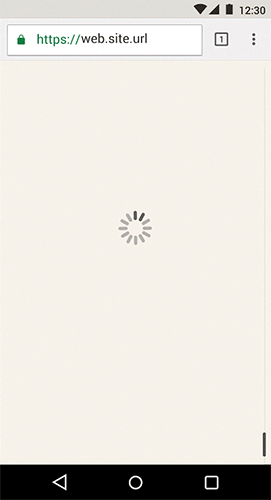
Showing a blank screen is bad, keeping the user on hold without any feedback, but showing a spinner is equally flawed.
In this example you see a newspaper app I mocked up called Tailpiece. Load time feels longer because the user is left waiting for content. Also, it shows the app in a “thinking” state rather than “working”.
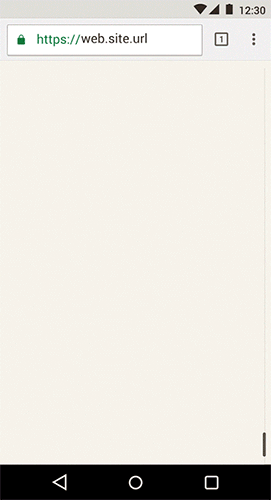
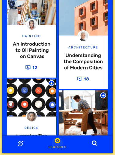
Filling the screen
In this example, instead of using a preloading spinner, we fill the screen with skeleton content. Though this is better than the above, using it on its own in place of a preloader isn’t great. Because it still gives the feeling of an error and doesn’t show any context for the type of content that is coming.
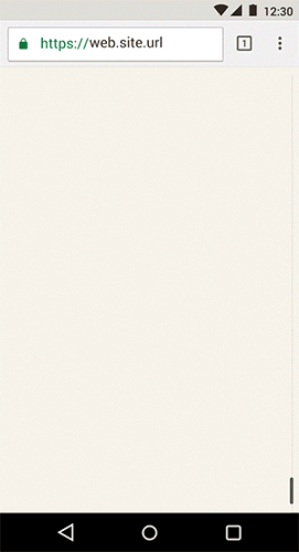
Staggering
Using a mixture of skeleton screens, contextual metadata and pixelated images that partially load, you can occupy a lot of the user’s time and make the whole experience feel faster. The idea is to give context to the user of what’s coming and load in things as quickly as you can.
You can also stagger animations to hide the loading time. We do this with our material studies as you can see below.

Staggering is very useful as well, as it creates a nice build up before the initial transition, again occupying the user’s time.
Navigation
Studies by Facebook, RedBooth, Spotify and Google Plus show that hiding menu items means that users didn’t tap or click them. Facebook also found that the switch to bottom navigation made the apps perception of speed seem faster. Because out of sight is out of mind and seeing an item quickly makes the experience feel faster.
So making your primary call to action visible at all times helps. You can see from the example below with our material app, Owl, does a great job of both having a custom design but still keeping with the philosophy of keeping main navigation items always visible and constant. Bottom navigation also is more ergonomic on mobile devices, as the user can reach the buttons using one hand, again helps keep the experience quick and natural.
Feedback and reassurance
Letting the user know what is going to happen is critical, but informing them of the action they have triggered also helps make your apps and sites feel fast. Using motion, hover states and ripples you reassure the user that the action they took is in progress.
By using a number of these design techniques, you can help the user of your apps by guiding them to where they want to be and also make your apps feel faster by reducing user anxiety. To learn more about user perception and how you can design for it, be sure to check out our Ebook, Need for speed, for more information.
Notes
This article is for a new youtube series called “Designer Vs Developer”, which you can see here on our Youtube Chrome Channel. You can also listen to a longer version of the conversation by downloading or subscribing to our podcast.First appeared in Creative Review.