The Gestalt principles are a series of laws that are used to explain why human beings naturally find organized patterns in objects they see around them. The goal with the principles was to explain why we group objects in some ways but not others.
There are many different principles, but here I am going to look at the ones that effect grouping, these are; proximity, similarity, common fate, continuity, closure, and prägnanz.
Proximity
When items are seen closer together, they are perceived as a group even if the individuals are a different shape. We see this in magazine layout, where elements of a double page spread will be closer together when compared to sidebars or boxes.
Another example of the effects of proximity can be seen in the image below, the items on the left appear to be an equal set of circles formed together to make a square, but if you increase the distance between each grouping we perceive columns. This effect causes the first set to feel like they have been assembled into a square, to the point where we don’t see the circles as individual items, the same with the columns.
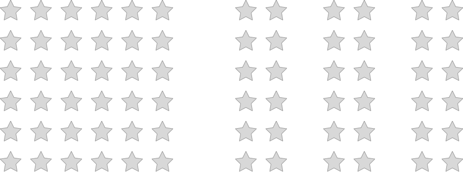
Sometimes this assemble feature can be used to create shapes that are not there, but we perceive them because of the proximity of all of the items in our design. The other key thing here is that small individual the shapes do not have to be the same shape for us to see the grouping.
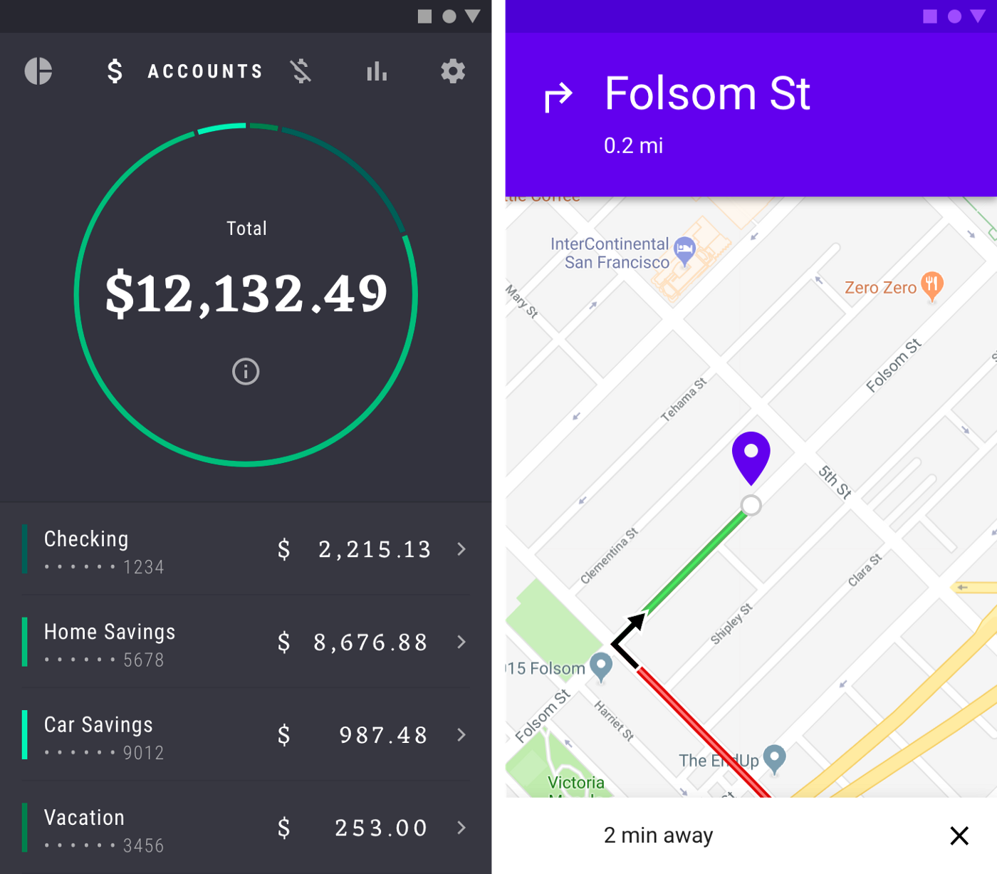
On the right: A navigation app uses proximity to differentiate between main and side roads. Also, the shapes of the blocks are different, but we still group them like complete squares.
Similarity
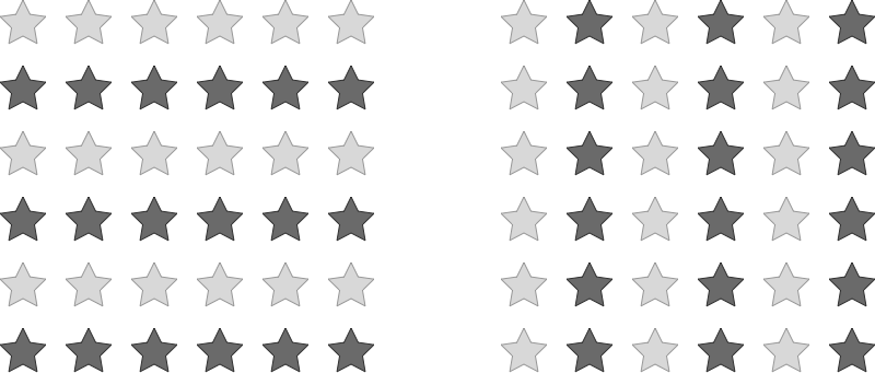
This law and proximity mostly work together, the difference being that we see a much closer relationship between items if they look the same. So if you have overlapping patterns, you will break them down into shapes based on the similarity of the individual elements. So in the example below, you see rows and not columns because similarity can trump proximity.
Similarity and proximity are used together in layout, so when designing UI, we box collections of elements together to show that they have a related meaning and make the whole look similar so we can understand their general context.
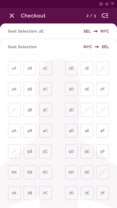
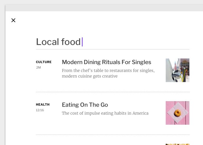
For example, the proximity between the items in this search result for the news app Fortnightly shows that they are a part of the same news item. Then when we take a step back, we observe the patterns of similarity, the topic on the left, metadata below, title in the middle, picture on the right. We start to see these as news stories and separate them from the search UI at the top.
Common fate
When items move together in the same direction at the same speed, we see them as part of a whole. The typical example would be a school of fish or flock of birds, as they move together they are seen as a complete unit. Motion is key here.
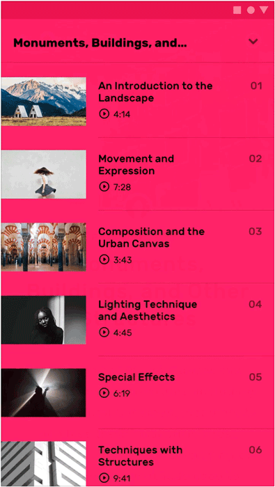
To guide a person from one part of an app to another, we can use motion to demonstrate what items are related to each other. Below we see the educational app Owl, expand and collapse its menu in a complete form rather than having different elements fly in at different times and angles. This helps the user understand the relationship between the items within.
Closure
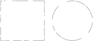
The idea with closure is we see complete objects where they don’t exist due to the negative space in between other shapes. So we see a shape because our brain closes in the gaps.
So the shapes below are incomplete, but our brain sees them as a whole;
Another example would be icons that require some distinction but would still need to be legible, such as different states of an icons below. Closure is being used here, even though the shapes are actually different when there is negative space we can still see them as a complete whole.
Prägnanz
Also known as good form, prägnanz is about the brain picking the simplest forms and shape for our brains to render, so if you take the Olympic rings, we see five circles as opposed to the cut-out shapes that are made in between each intersection. We see this often in logos in UI design or icons as our eyes will find the simplest forms first as this helps us understand what we are looking at.
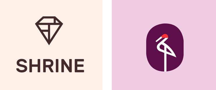
For example in the logo for Shrine, we see a diamond shape and not the capital letters ‘T’ or backward ‘F’. The same applies to the Crane logo, we see the bird and not the overlapping lines.
Conclusion
By using these principles in combination, you can guide your viewer/user through your layout, logo and UI designs. The goal to recognize that people will break things down to the purest possible form and are attracted to those. This is why we see elegance in simplicity and shun complexity. There are many other principles, such as continuity, symmetry, and figure-ground but I’ll leave it for you to find out more about those.
Notes
This article is for a new youtube series called “Designer Vs Developer”, which you can see here on our Youtube Chrome Channel. You can also listen to a longer version of the conversation by downloading or subscribing to our podcast.First appeared in Creative Review.